
.png)
.png)
Summary
READ ITLanding page vs. Product Page Comparison
What is a Product Page, and what is it for?
A Product Page, also known as PDP, is a page on a website that shows the viewer a set of goods and services. On this page, you will see quite generic information about a product. One thing is that the information is quite straightforward. This shows that it is for any and everyone to read and understand. Consider it as a tailored outline with features, prices and availability all stated. This is why all the key information needs to be listed on this page.
If we come across this page, and we didn't learn anything about the company, we would want to immediately close the page and exit the site. So, this page needs to be set up. Product pages usually have one or two CTA, which is added to cart or checkout. Another CTA could be the products recommended for upsell or cross-sell.

What is a Landing Page, and what is it for?
Yet, a landing page is quite the opposite. Why that?
A landing page has one goal: to convert the website visitors into leads, or customers. It only has one clear focus, for one specific audience. The landing page will give a clear overview of a product, containing more details than the PDP.
This is because a landing page needs to have more specific information. This is for visitors to take action, such as:
- buying the product
- going to the associated PDP
- fill a survey or a form
- leave their email address
- subscribe to notifications
Moreover, if someone lands on the page, it is likely the first time they are coming across your brand. From this short explanation, I am sure we can understand what the goal of this page is.
In short, the primary goal of a landing page is to drive specific traffic (whether paid or organic) to it, and convert it into customers.
How do we do that? There is always CTAs on the page. Also, landing pages are less "noisy" than most pages. For example, some websites choose to remove the navigation bar to eliminate noise. The goal is to cut any distractions.
A well-designed and optimized landing page helps any business to increase conversions, leads, and sales, for specific traffic sources and customer cohorts.
Main elements differentiating Landing Pages and Product Pages
The main elements that differentiate these pages are their purpose, structure, and content.
Purpose
The first difference between these two pages is of course the purpose. The main purpose of a landing page is to convert website visitors into customers, or leads.
On the flip side, a product page aims to give a complete understanding of the products the company is offering. Hence, making it easier for us when making a purchase decision.
Structure
The way landing pages are usually made is with an organized structure (often called “a funnel”). This structure will lead the viewer towards converting. This is by either making a purchase, starting a free trial or even filling a form. The landing page structure is focused on one and only CTA.
Whereas a PDP is way more generic, as it covers everything about the product (as I have mentioned above), this page has one main CTA. Either add-to-cart, or direct checkout. These CTAs can also be displayed next to each other.
Content
If you have come across landing pages already, then you've noticed the content is specifically organized to lead visitors to a clear point. They also use a very convincing tone, stating only a few benefits. This is all due to the fact that they want us to take some action after reading it.
On the other hand, product pages, will give a broad breakdown, covering details of all the products. This is because a product page focuses on the product itself, not on the type of traffic viewing this page. It may include customer reviews, tutorials, F.A.Qs, etc. This is to ensure visitors learn everything about the products they are interested in.
When Should You Use a Landing Page over a Product Page?
Three use cases to start using landing pages
1. Drive higher ROI for paid traffic
When it comes to ROI for paid traffic, it is crucial to ensure that the money you spend on ads is not wasted. So, how do we do this?
When this type of traffic comes to your website (also known as leads), they expect to see what they have searched for. If they don't immediately see the relevant information, they will most likely exit the website. And, I can guarantee we all have done that as well.
How do we avoid it, then? The visitors are coming to the website with some intentions. If I want to buy something, I would want to see a CTA option that would take me to check out and pay. This will for sure boost your ROI.
2. Run some tests
One of the most beneficial tools for e-merchants is A/B testing (also known as split testing). Landing pages are targeting a very specific segment. Use a tool like Hotjar, and see how this segment reacts to your pages copy and content.
By running tests, you will be able to see what works for your specific target market, and learn from your cohorts. For example, you would be able to define the average number of clicks it takes to check out. You will also be able to see what types of content get visitors attention, by using heatmaps.
3. Target specific customer segments
To sum it up, landing pages are highly effective for targeting specific customer segments since they allow you to tailor and personalize each page to a particular group. You have the flexibility to modify various elements, such as headers, layout, and text, to suit each target segment. Additionally, you can customize the call-to-action buttons to cater to the unique needs of each segment.
Why are both necessary?
Despite me pointing out vast differences from each of them, they both are important to have. Yes, they both have different functionalities, and that's exactly why you require them both. But, let's dive deeper into why they are necessary.
A product page can be posted and will not depend on a landing page, whereas a landing page depends on a product page.
Moreover, both these pages are on different parts of the customer journey funnel.
Now, what do I mean by this? Landing page is the page which gets all traffic. Then, the CTA from this page in most cases will redirect you to the product page. The PDP is at the end of the customer journey funnel, as most customers will come to this page to get even more details, and then check out and pay.
The presence of a landing page relies on a product page, whereas a product page is not contingent on a landing page.
Different visitors require different experiences
Did the traffic come via organic, or paid?
Landing pages that are created for post-click interactions are specifically tailored to target visitors coming from ads. Consequently, when visitors arrive at the landing page, the potential for generating advertising revenue (ROAS) is optimized. If the landing page is personalized and adjusted to meet the customer's specific requirements, it is more likely that they will convert.
What’s the main goal of the page? Is it conversion?
As explained throughout this article, landing pages are designed to target visitors who are likely to convert through calls-to-action (CTAs), while product detail pages (PDPs) are primarily informative. Yet, obviously, PDPs propose visitors call-to-actions to foster conversion.
Where is the customer located in the customer journey funnel?
Identifying where your customer is in the funnel is very important. This is because depending on where they are correlates with an exact experience. This means that if they are on the top of the funnel, they have learned about the e-commerce company. From there they will be directed to the next page in which they will learn in detail about all the products. Whereas, if someone is identified to be at the bottom of the funnel. They are going to check a specific product and will most likely convert into a customer.
5 Examples of High Converting Ecommerce Pages
1. Cosmetic brand: Example of Landing Page vs. Product Page
Highlights for Atashi Cellular's Product pages:
- When I came across their PDPs, I noticed that its main focus was centered around product-oriented benefit. Moreover, the page was very easy for me to understand, so I am sure it will be for you as well.
- One of my favorite things to see on websites now are customer reviews because it shows me authenticity as they are not trying to hide anything.
- They have a very intriguing carousel banner, which probably boosts their AOV (avg. order value)
- They also have included a vertical video from a professional, and this shows more credibility.
- Overall, the PDP is quick, generic content focusing on this single product.
.png)
Highlights for Atashi Cellular's Landing pages:
- If we take a close look, we can see that the publishing date is visible. This shows me that this content is recent and is probably relevant to us.
- I know we all have questions about a product before buying it. Luckily for us, Atashi has a detailed blog post that might clarify any of our queries.
- Want to see how to use the product? No need to go on YouTube or TikTok because Atashi has a short video tutorial.
- The most essential thing of a landing page is to have CTAs, and Atashi has clear ones. The product is tagged with a possibility to go to the PDP, as well as an add-to-cart (ATC) button.
- The author is a professional, and has a quick description of her at the end of the article. This makes me trust what she's saying about the product, it shows me authenticity.
- Overall, there is specific content focusing on a specific question or problem.
.png)
2. Fashion brand: Example of Landing Page vs. Product Page
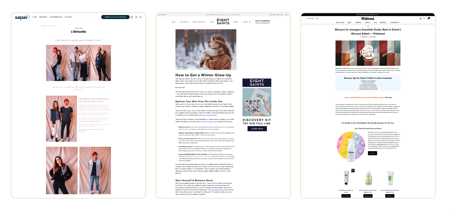
Highlights for River Island's Product page:
- As we can see, this PDP is very simple and easy to understand as the details are clear and concise about the product.
- They have added a nice feature where you are given the choice to pay in three interest free installments.
- If you scroll to the bottom, you will see their carousel banner with different goods. We can see that they are trying to cross-sell. They have an option right underneath the shirt. They have added a “complete the look” which shows us what the whole outfit would like. This is of course them trying to upsell.
- I like how effortless it is to understand the page. I love how clean the page looks and if you click for more details the way the page opens up from the side. And despite it being detailed in some areas, it is still pretty direct.
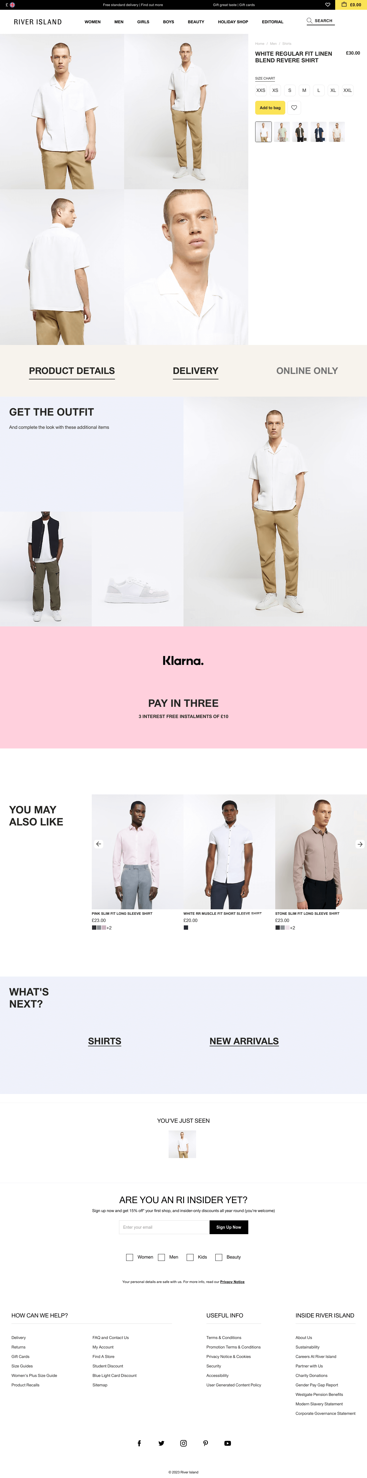
Highlights for River Islands Landing page:
- As we can see on the landing page, there is one suit, but it has three purposes or occasions. I am fond of how they have given each suit a short description and section.
- Another smart trick they have done is they show users what way is appropriate to style for different occasions.
- Each type of suit has its own CTA, and that makes it a lot easier to navigate through this website.
- I like this website because it is not overcrowded, and it is organized. So it makes shopping on this website very seamless.
3. Home & Garden brand: Example of Landing Page vs. Product Page
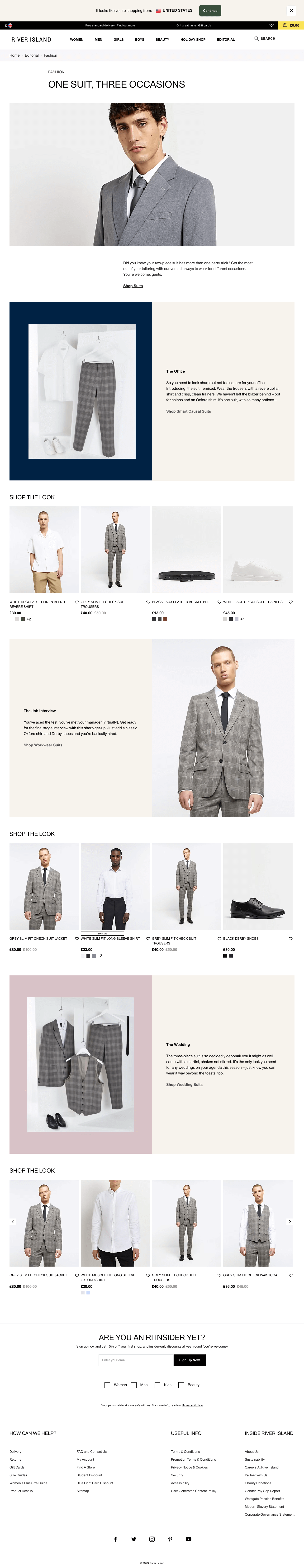
Highlights for Ikea's Product page:
- My first impression of Ikea's PDP is that it is clean, simple, and direct to the point. But, for me the more you scroll down the more crowded it gets and that makes me feel overwhelmed.
- Something that I do love is the way the details pop out the same way as River Island, for me, it gives a more professional look to the page. Also, it keeps it more organized.
- This page has one call to action. Which is to add to cart and if you do not prefer this good. Feel free to scroll down as Ikea has given you the option to see related items.
- Ikea has so many goods and services to offer, and I see that they are trying to keep it tidy, but for me, they need to tone it down a notch.
Highlights for Ikea's Landing page:
- Looking at the landing page of Ikea's, it is similar to the River Islands’ one. Who inspired who?
Ikea's discusses separate room decors to give your room a refreshing bedroom makeover. The layout of the landing page is very organized, and it is almost like it's in steps. - On each new piece of furniture listed they have put a CTA where you can for example see all the bedside tables.
- On top of that, Ikea has posted a picture of a bed and other furniture surrounding it. As I move my mouse over each piece of furniture, there will be a link to take you to see that exact same good. So they have added many CTAs, and, as a user, I can not complain cause it makes it so much easier for me to use.
- In comparison to the PDP, I much more prefer the landing page. Due to the simple reason that the attention to detail on the landing page is way more.
4. Sport & Fitness brand: Example of Landing Page vs. Product Page
Highlights for Gymshark’s Product page:
- From all the PDP's that I have taken a look at, Gymshark has the most simple and basic one out of all of them. And that makes sense, as Gymshark is focused on product-oriented benefits.
- On the PDP, they do not promote anything other than the shorts (in this scenario). Whereas, we have seen some companies promote other goods via a carousel.
- The page consists of a brief description of the good and how it will look, as well as delivery and return policy.
- It is a very plain and minimal PDP that some could consider boring. If you are that customer, and you know what you want, this site will be your favorite. Indeed, you can use the call to action, which is add-to-bag or wish list. Your process will most likely be smooth since you won't be distracted by external elements.

Highlights for Gymshark's Landing page:
- The first thing I noticed was that this was published this a few weeks ago. So we all know that this content is not dated and is relevant right now.
- This blog is so detailed and is very comprehensive. So, I am certain that any of your queries will get cleared up as soon as you read the whole blog.
- The blog is broken down into different types of gym clothes for different gym workouts. Each new gym item has a call to action that will lead you to its desired PDP. Gymshark also shows how each clothing item would look like, in the way it will be utilized.
- It has the essential information stated as well as many pictures. So we know what to expect if we convert into a customer.
5. Household brand: Example of Landing Page vs. Product Page
Highlights for Unbottled Product page:
- Most companies on this list did not have ratings or reviews on their website. That is not the case here, they have shown their ratings and exactly how many people have rated them. On top of that, each product has its own rating.
- If we scroll to the bottom of the page we will see customers reviews and some of them are quite detailed. Moreover, they have added a see more option for their reviews that shows how credible they are.
- Also, as you scroll down, you will see that Unbottled is promoting a carousel of complementary products. This is likely to boost their AOV.
- There is only one call to action which will let you add the item you are viewing to the cart.
- A product bundling option is proposed, making customer save money, and the brand to boost it’s AOV.
- They do a good job conveying their message about how their good is beneficial for the planet.
Highlights for Unbottled Landing page:
- This blog is very thorough with what it says and is very detailed. The first thing you see is the author's name. She is encouraging readers to contact her if we have anything to ask or say. This shows me honesty and friendliness. As they are encouraging you to speak with them or give your feedback.
- They have a fun little comparison table that shows the benefits of their soap in comparison to its competitors. This clears any doubt that a customer could have. Moreover, they have placed the same CTA in different places of the page. It can either take you to buy the botteless shower gel. At the complete bottom of the screen there is another CTA which redirects you to discover all the other products.
- Another effective strategy that they have used is that they have shown before and after pictures results, with the use of their shower gel. This will give consumers comfort as they know results are achievable from this item.
- This landing page is my favorite so far. They have incorporated a fun comparison table design. As well as placing their companies' benefits. Furthermore, despite it looking like there is a lot of information, it is a very brief listing of differences that is also very informative.
Get unlimited Landing Pages Templates from other eCommerce Store!
How to save landing pages you like?
Swipewell is one of the better organizing tools on the market, in my opinion. This is because this tool allows you to save all your marketing inspiration in one place. Let me break it down in a few steps:
- You can take a screenshot with one click via their Chrome extension
- Send emails that are worth swiping to your personalized Swipewell email address.
- This tool makes life so much easier with the use of its bulk import feature. So, sorting a lot of screenshots will never be easier.
- You can build a swipe file with a couple of clicks on your phone. It includes both iOS and Android.
- You can invite 3rd party users to see selected examples by embedding tiny codes on your platform.
- This tool allows your whole team to work on projects together.
Then, how to transform landing pages into design?
If you ever used Figma, and you do not like to create your own landing pages from scratch, you're in luck! I have the perfect tool for you!
With the use of html.to.design Figma plugin, it lets you transform landing pages you like into fully editable Figma designs.
Here are the steps:
- Save all pages you like on Swipewell
- Select the best one(s)
- Run the Figma plugin into it
- Get a fully editable Figma design
- Modify it accordingly: your brand's logo, your font, etc
Hope this will help some merchants out there!


